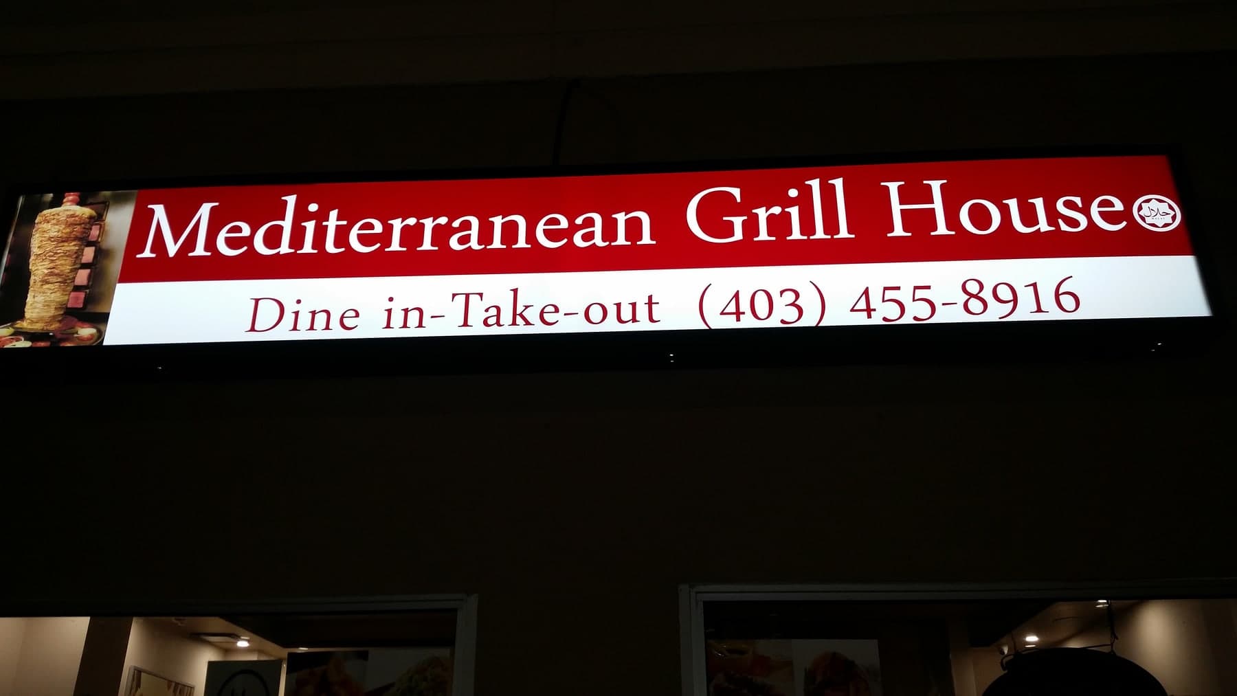
The restaurant needed stronger nighttime visibility and a sign that communicated its established, welcoming character at a glance.
Design direction
A deep red field, classic serif lettering, and restrained food imagery create a memorable identity without making the fascia feel crowded.
Production approach
Artwork was prepared for crisp large-format output, illumination was balanced across the full face, and contact information was sized for useful street-level reading.
- Even internal illumination
- Durable translucent face graphics
- Clear hierarchy from name to service details
Business impact
The finished storefront is easier to identify at night and presents a more confident, coordinated first impression for dine-in and take-out customers.
Have a project in mind?
Start Your Project